Thursday, September 15, 2016

The Miracles of Chalk Paint (or How I Came To Love That Once Ugly Chest)!


 See this chest?  I hate, loathe & despise this chest.  I've had it for at least 20 years & I've always hated, loathed & despised this chest because it's so dark & matches absolutely nothing in my house.  The only reason I kept it is because it was my Grandma Harris's & her I loved.  I kept a white lace tablecloth thrown over it, but I knew under it lurked this hideous thing like an unwanted house guest.  Did I mention how much I loathed this thing?

Then I read about something called chalk paint.  You mean I don't have to sand or prime anything to use it &, since I'm all about the vintage, shabby look, I don't have to be painstakingly careful about how I apply it?  ARE YOU FREAKIN' KIDDING ME?!  How did I not know about this?  Oh, baby, give me some of that!  The first thing I'm trying that out on is this loathsome chest - I hate it anyway so what harm can it do?

First coat on & I'm already liking it better than I did.  I'm using Americana Deco Art Chalky Finish Paint in Everlasting (white).  Actually, this was the only coat I put on.  I just kept fiddling with it until I had it distressed to my liking.


Now, of course, this is no place to stop.  How boring would that be?  This baby needs some stenciling.  I decided to go for a Parisian steamer trunk kinda thing.  Love me a harlequin print!  For the stenciling I used my favorites - the Art Alchemy Metallique Paints.  Because I used them over the chalk paint, they don't have the shimmer they usually do, but they worked just fine nonetheless.  I had painted the hardware with the white chalk paint & dry brushed it in Bronze to bring up the detail.  Much better!


I went in a different direction with the lid.  I love crows - think they're smart & cool - so I dragged some Golden coarse molding paste through my crow stencil for each corner & the middle & gave them each a crown too while I was at it.  Used the molding paste for rest of the motif too.  Once everything was dry, I painted all of it, but found it was just a little too perfect.  Some sandpaper took care of that & knocked back the new.  To finish the lid, I took my French script stamp & stamped over the entire thing in black.


Not too crazy about how the leaves & branches turned out.  I tried mixing the paint with the molding paste thinking to save some time.  It did, but came out looking more like Play-Doh & sanding it back didn't help since the paint was mixed in.  The only way to fix this is to sand it off completely & redo it & that ain't happening.


I decided that the front still looked a little too plain so I whipped out one of my favorite pieces from Relics & Artifacts, hit it w/ some bronze paint & voila - that's better!  It was begging for a medallion there.


Ok, so we've got the front & top taken care of, but what about the sides?  Now, don't panic - of course I got to those too!  I decided I'd try an image transfer & it definitely needed some drawer pulls which it didn't have.  Now, I can't go putting on these shiny, bright pulls on the thing - not at all the look I'm going for here.  So, what am I supposed to do - clean them, then leave them in a large closed yogurt container layered between paper towels doused in ammonia & cover them in salt - that's what!  A few hours later & instant patina!  Ok, one of the pulls took a full day because I forgot to clean it first.  Don't do that.  Also, I HIGHLY recommend doing this outdoors & being, very, very careful because of the fumes - they'll knock you out if you aren't careful.  


So, what happens when we throw it all together - THIS!


And now I'm in love with it!  So much better than that ugly, dark thing previously lurking in my living room, don't you think?

As an added bonus, this is the little Alice in Wonderlandish table I painted next.  My intent was to start on the kitchen cabinets, but that felt very big & scary so I decided I just had to have this instead. At least it was productive procrastination & it makes me smile every day when I open the front door.


Monday, July 11, 2016

A Creative Jumpstart - My Homemade Business Cards


Hello my peeps!  Miss me?  No?  Well, do me a favor, humor me & tell me yes, ok?  :-)  

I haven't been very creatively inclined in the last few weeks since I totaled my beloved Outback which, in all honesty, I would have kept for the rest of my life, & had to got through the process of finding a new car.  Now that that's all squared away, I'm trying to get back on track.  As a jump start, I decided that I'd make myself some business cards for next weekend when I travel to The Queen's Ink in Savage, MD to take classes with one of my favorite artists, Finnabair.  I absolutely adore her work - it's so interesting & highly textured, always so much to see.  I cannot wait to absorb everything I can from her.

Now, I could have bought some cards, but first - what am I going to do with 500 cards?  And second - where's the fun in that?  I don't need many & it's a lot more fun & satisfying to make my own.  So, I started with some scraps off of a couple of manila file folders.  
First pass was to stamp the scraps using my Colorbox inks.  I love them for their vibrant & fast drying colors. 
Pretty much a mess right now, right?  Yeah, this is no place to stop & dull, dull, DULL!  Can't be havin' none of that!

Next up - stencils - lots & lots of stencils with lots & lots of paint.  As usual, the only paints I'm using are the Art Alchemy Metallique paints.  I love everything about them - the rich colors, the texture, the sheen.  See how gorgeous they are?
Ok, still not what you'd call a work of art - in fact they pretty much look like a muddled mess.  But a funny think happens when you cut them down.  Take a look...
Far more visually interesting now, right?

That was fun so I thought I'd try again, but started by painting the file folder cut downs with black gesso first.  I actually like these better & I almost didn't want to cut them up.
I think these came out really well.


And for the finale - drum roll, please - TA-DA!
I will grant you that these aren't the most professional looking cards, but I'm happy with them. Each one is unique & making them myself makes them special in a way that having them printed would never have been which means something to me.

So, what do you think?  I'm rather partial to the darker cards, but what about you?


Monday, June 6, 2016

Namaste from Yogaville

Saturday, my friend Amber & I took a trip up to Yogaville to visit our friend Danielle who is enrolled in their 30 day LYT (Living Yoga Training) program.  Here are our happy, shiny faces -it was freakin' humid! - & I'm the one in the middle - Hi again!

yogaville, yoga, meditation, lotus temple, living yoga training program
Danielle, Candi & Amber - Yogaville
This is my third day trip up to Yogaville which is about 1:15 hours from where I live.  The pictures don't do it justice - in part, because it was a really overcast day &, in part, because it's one of those places that you have to see to really appreciate.
lotus temple yogaville virginia
The building to the left behind us is the Lotus Temple &, yes, it really is in the shape of a lotus & it really is pink & blue.  Here's a bit better picture, but their website picture is the best.  Yogaville is located in Buckingham County, VA which is rural farms & woodland.  You really can't get more serene than this.  There are a lot of hiking trails around the property for you to enjoy it too.


This is a closer view of the arches in front of the Lotus Temple with Danielle & Amber striking Tree Pose - geez, can't take these guys anywhere! - and the beautiful mandala
                                                   that's there as well.

I'm a huge believer that people should be able to worship or believe in whatever they wish so I'm not going to go on about the nature of Yogaville - I just want to share the beauty - both natural & artistic - that's found there.  In the bottom half of the temple, there is a showcase for each of the major religions & in each case is sacred text & iconography, almost all - no matter the religion - focused on the need to be kind to one another.


This was taken upstairs in the meditation room. Isn't it beautiful? At the base, there are flames which are always lit. Around the room again, text from every religion.  The atmosphere & energy are so tranquil, peaceful & serene.  I think there's a daily 30 minute noon meditation there which I thought with my extreme monkey mind I'd find painful.  Instead, the time was up way quicker than I was ready.


These were taken at the shrine to Swami Satchidananda, the founder of Yogaville.  The picture on the left is of Shiva the Destroyer & the one of right is of the Swami who actually gave the opening address at the Woodstock Festival in 1969.  The picture on the Yogaville site of him giving the address is just amazing - how cool would it have been to have been there?  The picture gives me chills!

shiva the destroyer, yogaville virginia


These last few pics are of some of the statuary around the grounds.  If you look in the foreground of the first picture with the Buddha, you'll notice a small shrine to Mother Mary.  I think the second picture is just your garden variety cherub & the last is of Quan Yin - one of my personal favorites.  I actually have a little statue of her in my office.


After three day trips, I think my next trip up is going to be a longer stay.  This is just someplace that for me feels right - I get there, everything melts off & I feel like I can finally just breath.  I hope everyone has a place of their own like this whatever that may look like.

If you have any questions about Yogaville, pop me a comment or give their site a look.  Hope you enjoyed the pics as much as I enjoyed my visit up there & taking them.  Namaste y'all!

Sunday, May 29, 2016

Can You Hear Me Now? - Steampunk Style

I've had the same cell phone cover for a lot of months - it's pretty enough - red with a little bling, but I was ready for a change.  I don't have an iPhone (still bitter about all the trouble I had with itunes way back in the day &, yes, I am still carrying a grudge) so my choices are a bit limited, especially since I refuse to have anything to do with flowers, birds, stars, hearts, kittens or pastel colors - just not my style.  Kept looking & searching for the perfect cell phone cover, but no luck.  Then I had an epiphany - I have paint!  I have stencils!  I have glue!  I have gadgets!  Why am I looking for the perfect cell phone cover when I can make one exactly like I want it?

I started with this perfectly clear cell phone cover.  First step was to cover it completely in black gesso since nothing was going to stick to that slick plastic.

cell phone cover, art, steampunk, mixed media, metallic paint

Next up was to paint it in, of course, Art Alchemy's Steampunk Copper.  The next layer was a piece of old sheet music that I stamped with more notes, set on fire for the burnt edges & adhered to the case with some soft gel gloss medium to be sure the edges wouldn't fray up.

Not a bad start, but no where near finished.  This is my first pass.  The placement was ok, but it was definitely lacking in color & needed more personality too.  This was definitely something I could fix & fix it I did.

steampunk cell phone cover, steampunk, art alchemy metallique paint, sheet music
I pulled out the paints, the stencils & the Gorilla Glue & spent the next few hours making the cell phone cover of my dreams - ok, that's an exaggeration, but it is one that suits me a whole lot better than anything else I had seen in my search.  See, no hearts, no stars, no flowers, no kittens & no pastels.

steampunk cell phone cover, gadgets, art, steampunk, mixed media, art alchemy metallique paint, watches, keys, gears

I think this is one of my favorite things to do - take something that's so dull & ordinary & transform it into something uniquely personal.  I'll be doing a lot more of these projects in the future so stayed tuned...  :-)

Wednesday, May 25, 2016

Oh, The Places I've Been - Barcelona!


About this time two years ago, I took a trip with my ‘rents to sunny Spain – home of Picasso, Miro, Gaudi, El Greco, Dali. So much beauty & art & not nearly enough time to see it! I thought I’d share a bit of what I was able to see though in Barcelona. This is me & I’ll be your guide for the day.


So, how European do I look? This was taken on the upper deck of one of those Hop On/Hop Off buses & I swear the recorded tour voice sounded just like Dame Judy Dench. Maybe that’s her side gig when she’s not busy collecting Oscars & being honored by the Queen - you know, just for a little pocket change.

The city itself is like an open art gallery. First, there’s the architecture of Gaudi. With all those curves & whimsical details, it looks like something that belongs in a Dr. Seuss book! I would love to have gone into one of the buildings to see what the room proportions looked like & if the inside details were as fanciful as the outside. Unfortunately, I wasn't able to get a decent shot of any of the buildings - either the angle was wrong, we were moving too fast or something was in the way. Google Gaudi though & you'll see what I mean.


I love modern, abstract art & it’s obvious this city does too. This is just one of the statues that are scattered about the city. I don’t know the history or the artist, but it reminded me of Picasso – one of my favorites.

I have to give it up for the street performers too. This guy was set up in one of the ancient alleys around the Barcelona Cathedral. He had his pan flute hooked up to a little amp & the acoustics among all that stone was just amazing.

Then there was this guy who had his Janis Joplin marionette singing & dancing to “Piece of My Heart” in one of the plazas. He had all the moves down – hilarious! Don't you just love the shorts, cap & tie combo he's rockin' too?
.
The one thing we were cautioned about while in Barcelona was to be very careful while watching the performers because, unfortunately, Barcelona has the reputation of being the pick-pocketing capital of the world.


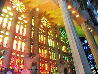
The most awe inspiring thing in all of Barcelona is the La Sagrada Familia Basilica – it is simply breathtaking. Gaudi became involved in the construction in 1883 & it still isn't completed. I got there about mid-morning on a sunny day & when I walked in just the light alone struck me speechless. It’s one of the very few places on earth that I’ve visited where I actually, truly felt peace & serenity. The pictures cannot possibly do justice but here are a few.


Despite the fact that there were tourists everywhere, the place still somehow managed to feel tranquil. I could have spent hours here absorbing the atmosphere & the art.

I only had a couple days in Barcelona so just barely hit the highlights there. With so many places in the world that I want to see, I rarely want to revisit a place, but Barcelona is someplace I'd definitely like to return to for a much longer stay. Aside from the art, I loved the city, the food, the energy of the place - it's one of the few places outside the U.S that I'd consider living. 

So, for when I return, anyone have any tips &/or suggestions as to what I shouldn't miss next time? I'll happily drink a sangria in your honor while I'm there if you do. :-)


Sunday, May 22, 2016

FYI...Halloween Has Been Rescheduled...

art, artistic, create, creativity, skeletons, skulls, stencils, moths, rib cage, crow skullI know...I know...weird, right?  Who moved Halloween?  Ok, maybe it wasn't moved - maybe it's just me & I decided to buy a bunch of weird things all at one time.  What can I say - they were on sale & I thought they were cool so I got 'em to use for something.  Don't exactly have a plan...but it'll come to me...just give me a little time...          
So, look at all the crazy stuff!


All this came from Retro Art Cafe.  I was looking for the perfect skull stencil, got sucked into their site &, well, this is what happened.  I found the stencil I was looking for & a whole lot more that I didn't know I wanted, but once I saw it decided that I couldn't live without it.  All the skulls!  All the skeletons!  All the dragons!  I mean, honestly, who buys just one of these?  That's just crazy!


I sat down & tried the stencils out immediately - big fan of instant gratification.  Check out the skull stencil - love it!

Bigger than I thought it would be, but looks exactly like I wanted.  The skull, rib cage & moth stencils are all made from oil board.  This is the first time I've bought oil board stencils - all my others are plastic or mylar.  I'm not too sure about how long these are going to last or hold up since I also use them with soft gel gloss to texturize.

art, create, creativity, moth, micro beads, art ingredients, soft gel, stencil Here's the moth made with soft gel gloss & some Art Alchemy Micro Beads sprinkled on top just to see what it'd look like & what would happen with the stencil.

The gel wiped right off so I guess I'm ok there.  I'm still considering spraying them with a protective coating just to be on the safe side.

All the chipboard pieces that I ordered - the dragons, scroll work, antlers - came still attached to the chipboard it had been cut from which was great because, once I punched out the pieces I wanted, I had a new stencil!  These definitely need a protective coating or they aren't going to last too terribly long.  I love that fact that I got a 2 for 1 deal here.  Now I've got more dragons to play with & who wouldn't like that?!

My favorite thing that I got was the crow skull cameo.  It was just perfect for a little goth/steampunk crossover cuff bracelet - my new favorite piece of jewelry.  Whatcha think?

art, creativity, create, crow's head skull, skull, steampunk, goth, bracelet, jewelry


Sunday, May 15, 2016

The Banishment of Boring Beige

For months, I kept looking over & seeing my beige filing cabinet in my studio.  Beige - is there any worse color than beige?  If black is the absence of  all color, then beige is the a absence of all personality.  My idea of hell is a world where everything is beige - well, one version of it anyway.  Can you tell I feel a little strongly on the subject?  So what was I doing with a beige filing cabinet in, of all places, my studio?  It was wrong...just so very wrong...

The first thing I did was spray paint it red.

filing cabinet, upcycle, stamp, stencil, paint, creativity, art, art studio


The color came out brighter than I thought & wasn't exactly what I was looking for.  I also did a horrible job, partly because I didn't know what I was doing & partly because I didn't have the patience to figure out how to do the job right before I started.  That was ok though because I was pretty certain I wasn't going to be happy with just throwing a coat of paint on it.

Next, I pulled out my currently favorite stamp - the death's head moth.  This stamp is so cool - can you see the little skull?
filing cabinet, deaths head moth, paint, stencil, stamp, art, creativity, art studio
 I got a whole squadron of moths going on, but I felt like it was still lacking.

Now, I'm not a big fan of subtly in my art - I like a lot of color & texture.  I also like the grungy look - lots of drips, drops, splatters, seemingly random marks  - so I got out more paint & more stamps, a stencil or two & a lot more color.  I spent the morning bringing some personality to my deadly dull filing cabinet & dancing around to some good, ole vintage rock 'n roll (which was not vintage when I first heard it) - AD/DC, Def Leppard, Aerosmith, Boston, Kansas, Cheap Trick, Foreigner.  Ahh, the classics!  Art & awesome music - sheer bliss & I was a very happy soul!

filing cabinet, upcycle, paint, create, art, stamp, stencil, deaths head moth


And this is where it ended - at least for now.  Much, much better & something that looks like it might actually belong in an artist's studio.

So, what do you think?  Vast improvement or something that makes your eyes cross when you look at it?